Fior d'Abruzzo — a brand worth its salt.
The
overview.
Fior d'Abruzzo is a premium extra virgin olive oil, pressed from a single region of Italy with real heritage behind every bottle. The oil was exceptional — but on a crowded shelf, quality alone is invisible.
This was an end-to-end brand build: identity, label design, supporting graphics and a Shopify storefront — one considered system that makes the craft impossible to walk past.
A heritage product, dressed to be chosen.
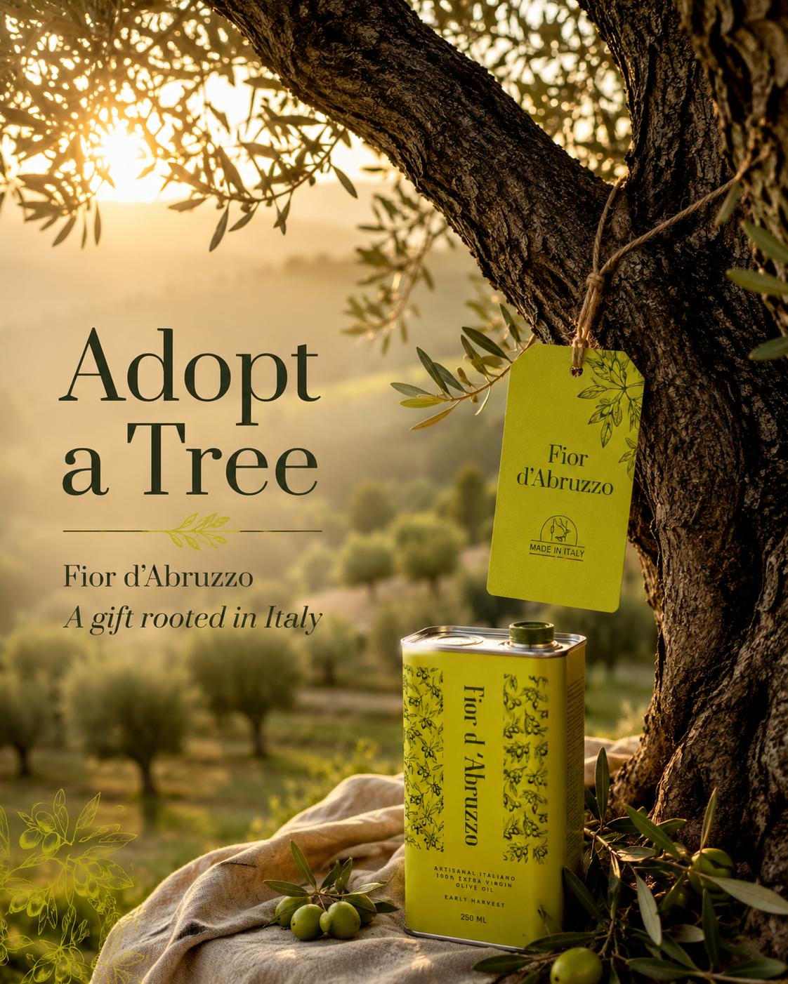
The story starts in the groves — silvery hills, generations of know-how, an oil with a genuine sense of place. The brand had to earn that story rather than decorate it.
That thinking carried into an Adopt a Tree program — a gift rooted in Italy that lets customers own a piece of the grove, turning provenance into a relationship rather than a tagline.
So the design leans into provenance, not pretense.
The
challenge.
The premium olive oil aisle is a wall of near-identical cues — rustic scripts, gold foil and Tuscan clichés. How do you signal authenticity and quality without disappearing into the same visual soup?
And it had to work twice: beautiful in the hand on a shelf, and just as convincing as a thumbnail on a phone, inside a Shopify store that had to sell without a salesperson.
Heritage you can see.
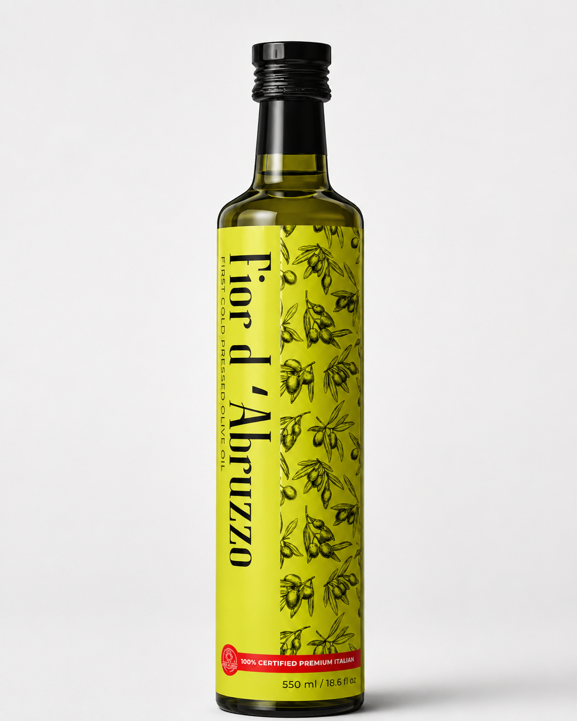
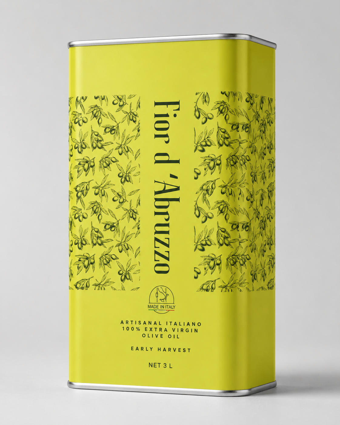
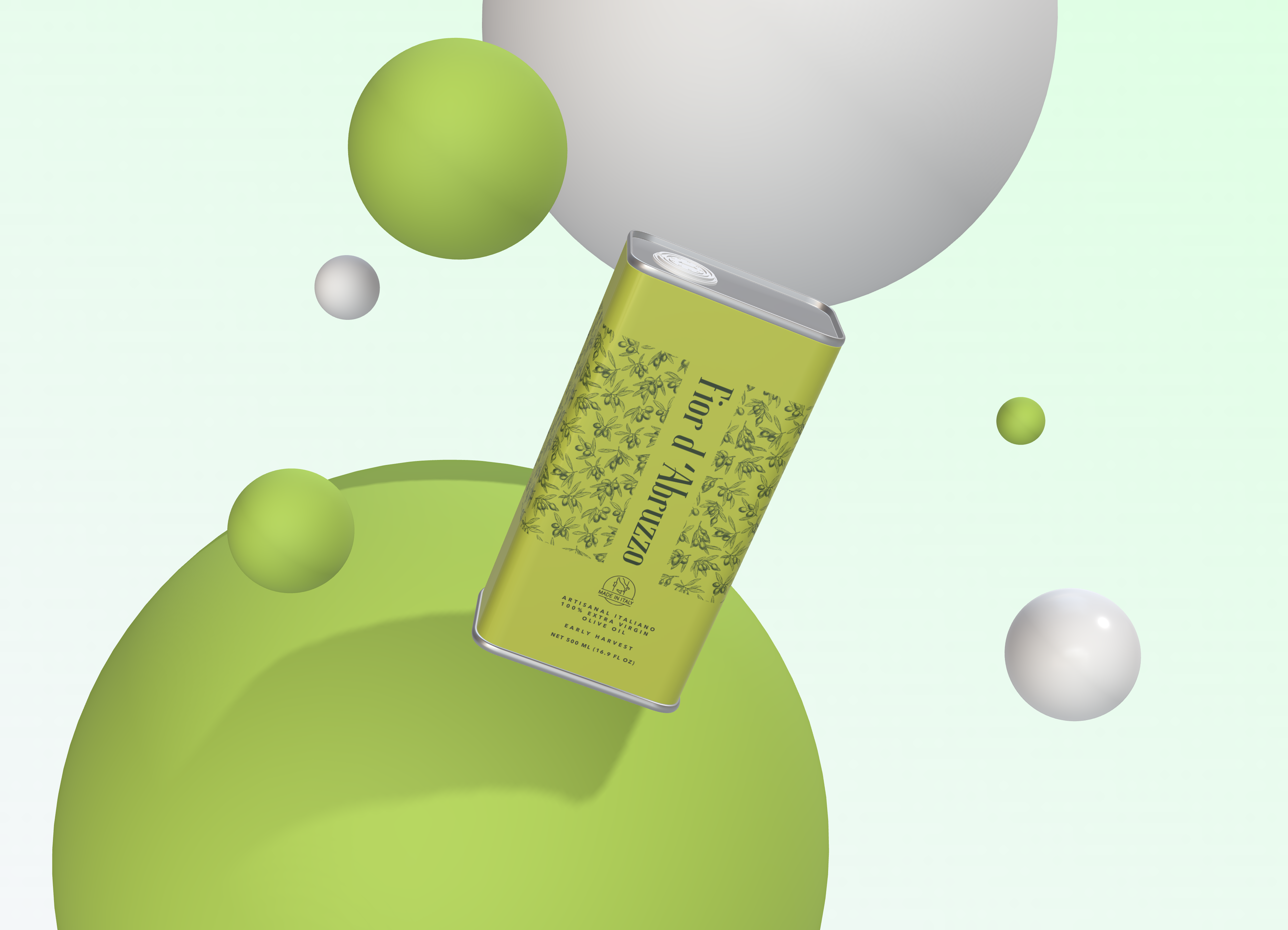
A vivid chartreuse label, hand-drawn olive branches and a confident serif logotype — warm, editorial and unmistakably Italian. Distinct on the shelf, radiant on screen.
The
label.
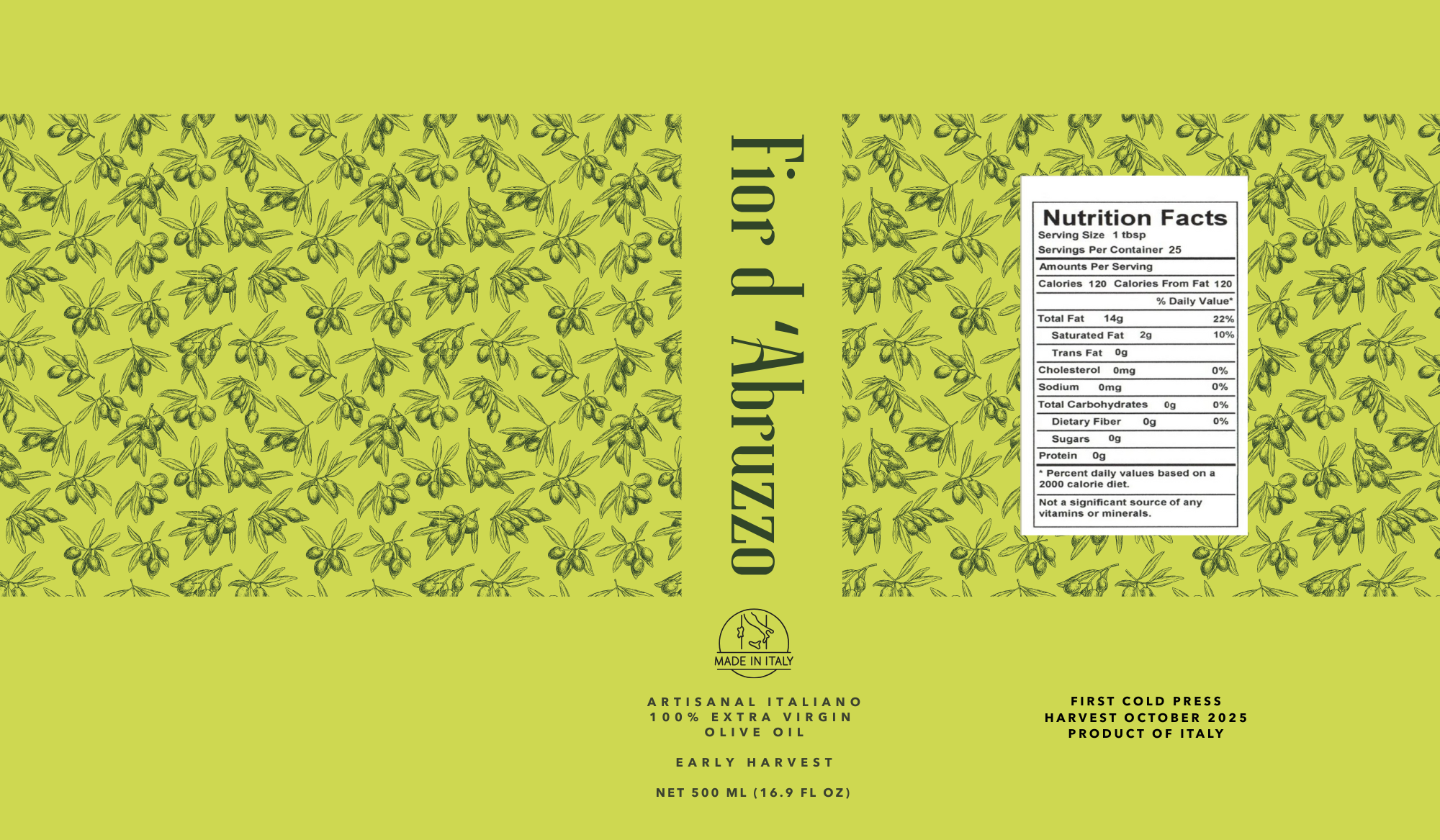
An elegant serif logotype set vertically on a vivid chartreuse field, framed with hand-drawn olive-branch line art and a considered back panel — nutrition, provenance and harvest date all part of the composition. The detail rewards a closer look, the way a considered product should.
The system.
From grove to cart.

What we
delivered.
- 01
Brand identity
Logotype, olive-branch motif and the warm, editorial visual voice.
- 02
Label design
Production-ready bottle labels balanced for shelf and screen.
- 03
Supporting graphics
Product photography direction, social and marketing collateral.
- 04
Shopify store
A clean, conversion-minded storefront built on the brand system.
- 05
Adopt a Tree campaign
A brand program and creative that turns provenance into an experience.
The result.
A label that stands apart in a look-alike category
One brand system spanning bottle, graphics and store
A Shopify storefront that converts without a salesperson
The result is a brand that carries its heritage with confidence — warm, premium and cohesive from the grove all the way to the checkout.
Bulimia Free
A rebrand with a point of view.
View Case Study